
Pie charts are classics for showing data, but sometimes you need a slice to pop—whether it’s highlighting your best-selling product or flagging an urgent issue. Exploding slices in Google Sheets is super simple, and it instantly makes your charts clearer and more engaging. Here’s how to do it in just a few clicks.
Why Explode a Slice?
Imagine you’re presenting quarterly sales results. Instead of a flat pie, pulling out the slice for your top-performing region grabs attention and tells the story faster. It’s perfect for reports, dashboards, or social visuals—no design skills needed.
Pie charts work great for showing data proportions, but sometimes you need to emphasize one specific piece. In Google Sheets, you can “explode” a single slice to make it visually pop out from the rest. Here’s how to do it properly.
Getting Started
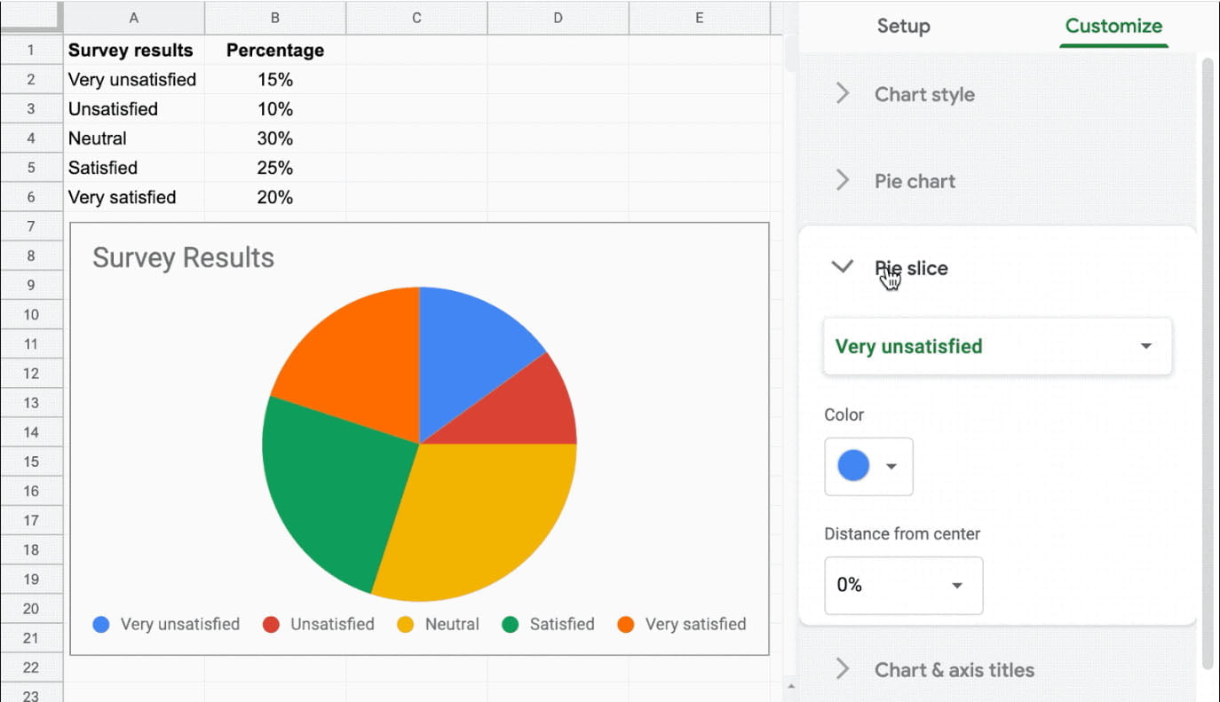
First, create your chart: highlight your data, go to Insert > Chart, and pick the pie chart option. Then, double-click the chart to open the Chart Editor. Under the Customize tab, find Pie slice.
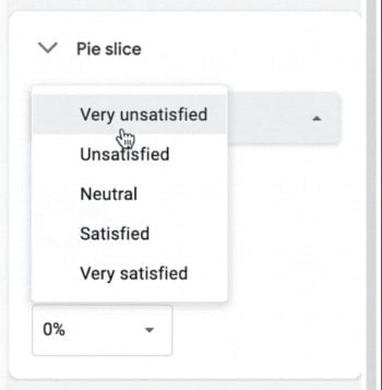
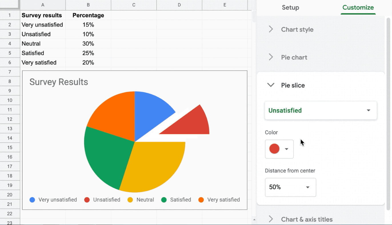
Click the slice you want to emphasize—maybe “Unsatisfied”, or select it from the dropdown list
Then select the option “Distance from center” and select, for example, 50%. Here is how is going to look.
Make It Look Pro
Stick to clean design: tweak slice colors under Slice colors to match your brand, turn on Data labels for clarity, and avoid 3D effects—they’re distracting and skew proportions. Simple always works better.
Why This Matters Now
With Google Sheets evolving for real-time teamwork and smarter analytics (like its built-in AI tools), a well-crafted chart does more than look good—it makes data stick for your audience. An exploded slice turns “just another graph” into a focal point.
Ready to Try?
Open Sheets, test it yourself (it takes 20 seconds!), and see the difference.
Questions? Drop them below—we’re here to help.