
Google Sheets does make it simple to create data visualization, but manually doing that each time is not desirable. Using a little Google Apps Script, you can automatically generate and insert a chart from your data. This is particularly useful if you are updating a table of data on a regular basis and would like a chart to be displayed in a certain location, with formatting already applied.
The following steps guide you through the process of writing and executing the script, positioning the chart, and adding a custom menu to allow users to run the script from the sheet interface directly.
Step 1: Open Your Sheet and Launch Apps Script
Begin by opening the Google Sheet holding your data. You’ll want some organized rows and columns – preferably with a date or category in the first column and numbers in the others.
Then, click on Extensions -> Apps Script. This will open the script editor in a new tab where you will compose the function that constructs the chart.
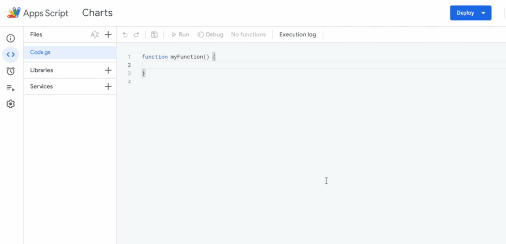
Step 2: Copy-paste the Script to Create a Line Chart
In the code editor, delete any boilerplate code and paste the following function:
function createEmbeddedLineChart() {
  const sheet = SpreadsheetApp.getActiveSheet();
  const range = sheet.getRange('A2:F102');
  const lineChart = sheet.newChart()
    .asLineChart()
    .addRange(range)
    .setPosition(5, 8, 0, 0)
    .setTitle('USD Exchange rates')
    .setNumHeaders(1)
    .setLegendPosition(Charts.Position.RIGHT)
    .setOption('hAxis', {
      slantedText: true,
      slantedTextAngle: 60,
      gridlines: {count: 12}
    })
    .setOption('useFirstColumnAsDomain', true)
    .build();
  sheet.insertChart(lineChart);
}
Step 3: Save, Authorize, and Run the Script
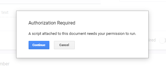
Click the Save button or use Ctrl+S. From the dropdown at the top of the editor, choose createEmbeddedLineChart and click the Run ▶️ button.
As you are executing it for the first time, Google will prompt for permission. Accept the dialog boxes and grant permission to access your Google account.
Note
If you have any problems with authorizing the script, check this guide: Google Script Authorization: Review and Accept the Permission Guide, or check the youtube video.
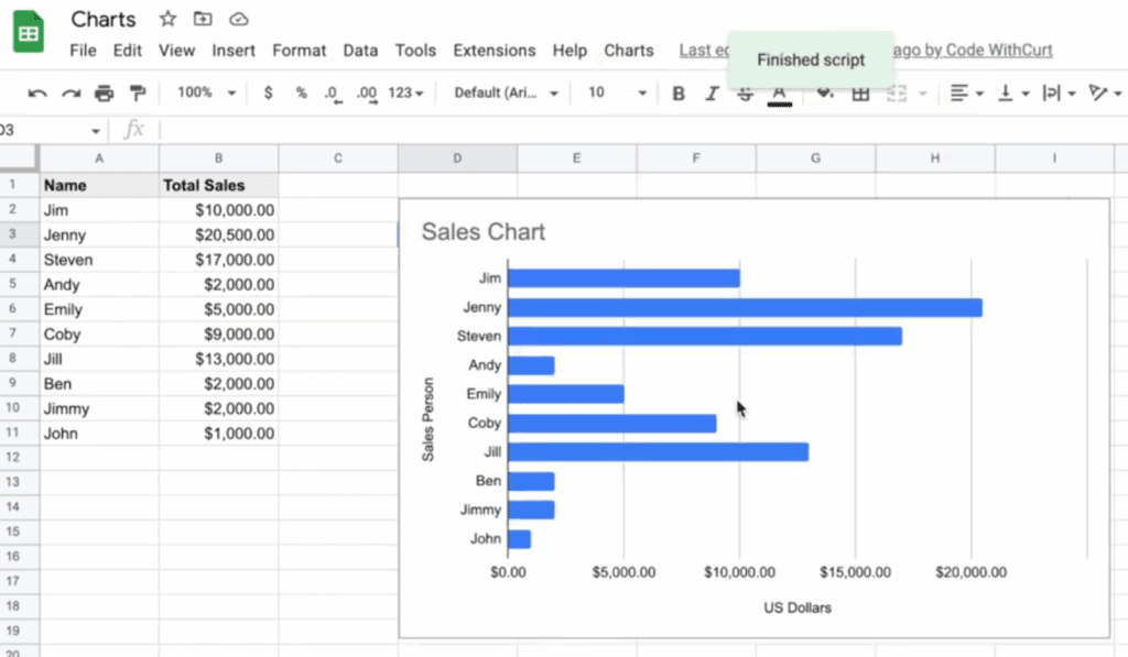
Step 4: View the Chart in Your Sheet
Go back to your spreadsheet. After the script runs, a new chart will appear starting at cell H5. It will reflect the data you specified and apply the formatting set in the script.
Step 5: Add a Menu to Run the Script from the Sheet
If you want users to trigger the chart from a menu instead of opening the script editor, add this function:
function onOpen() {
  SpreadsheetApp.getUi()
    .createMenu('Chart Tools')
    .addItem('Insert chart','createEmbeddedLineChart')
    .addToUi();
}
This creates a new menu called Chart Tools in your spreadsheet’s toolbar. Every time the sheet is opened, this menu appears and lets you run the chart script with a single click.
Step 6: Use the Script Without the Editor
Once the custom menu is added, here’s how to run the chart creation without touching Apps Script again:
1. Reload the Google Sheet.
2. Click the Chart Tools menu at the top.
3. Select Insert chart.
The script will run instantly, placing the chart in the same position as defined.
Notes for Customization
– Change the range ‘A2:F102’ to fit your dataset.
– Modify `.setTitle(‘USD Exchange rates’)` to reflect your own chart topic.
– Adjust `.setPosition(row, column, xOffset, yOffset)` to place the chart elsewhere.
You can also experiment with asColumnChart() or asBarChart() if you want a different chart type.