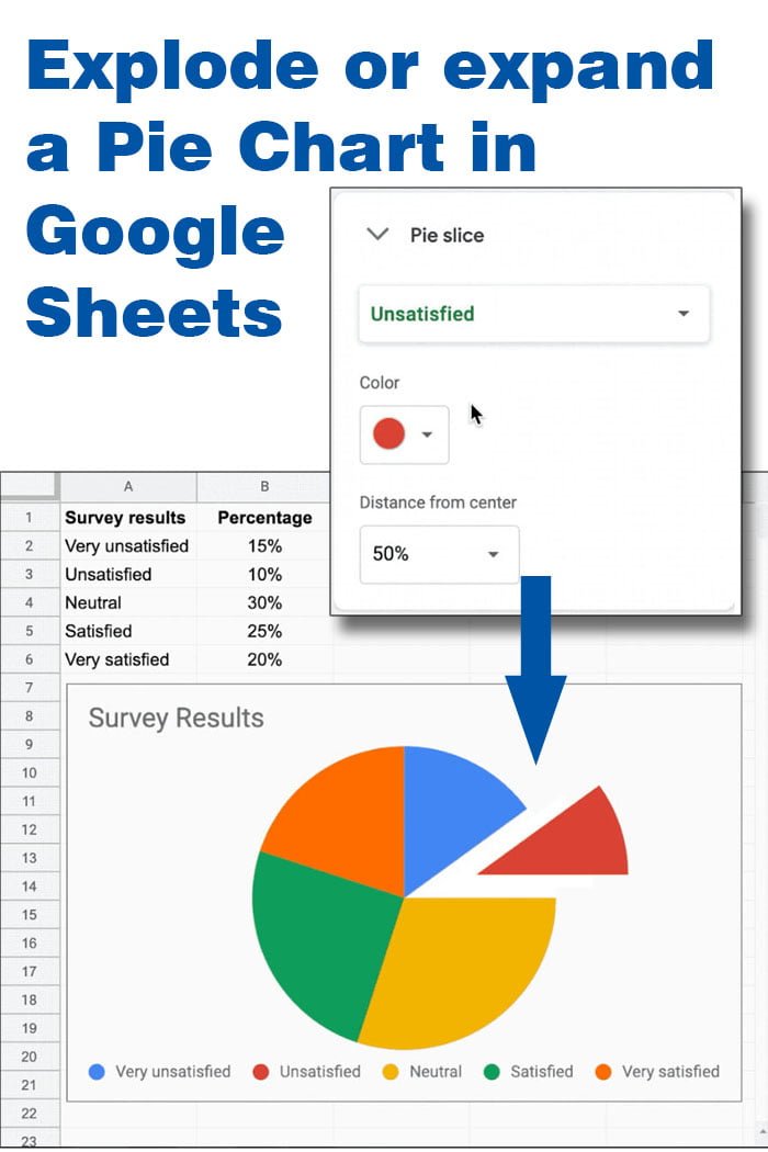
The most popular chart for presenting statistical data is the Pie Chart. You can use it to visualize the whole set of data in the form of a pie using the slices to represent each individual value.
For the creation of this Pie chart we used values collected with Google Form as a survey result. To create this specific chart, just select the values and select “Chart” from the Insert menu, or click on the “Insert Chart” icon from the toolbar. Using this type of data, Google Sheets is going to insert a Pie Chart automatically, if not, select “pie chart” from the “Chart type” drop-down list. To get the Legend to display at the bottom of the chart go to the customize tab, expand the legend options and select the Position to Bottom.
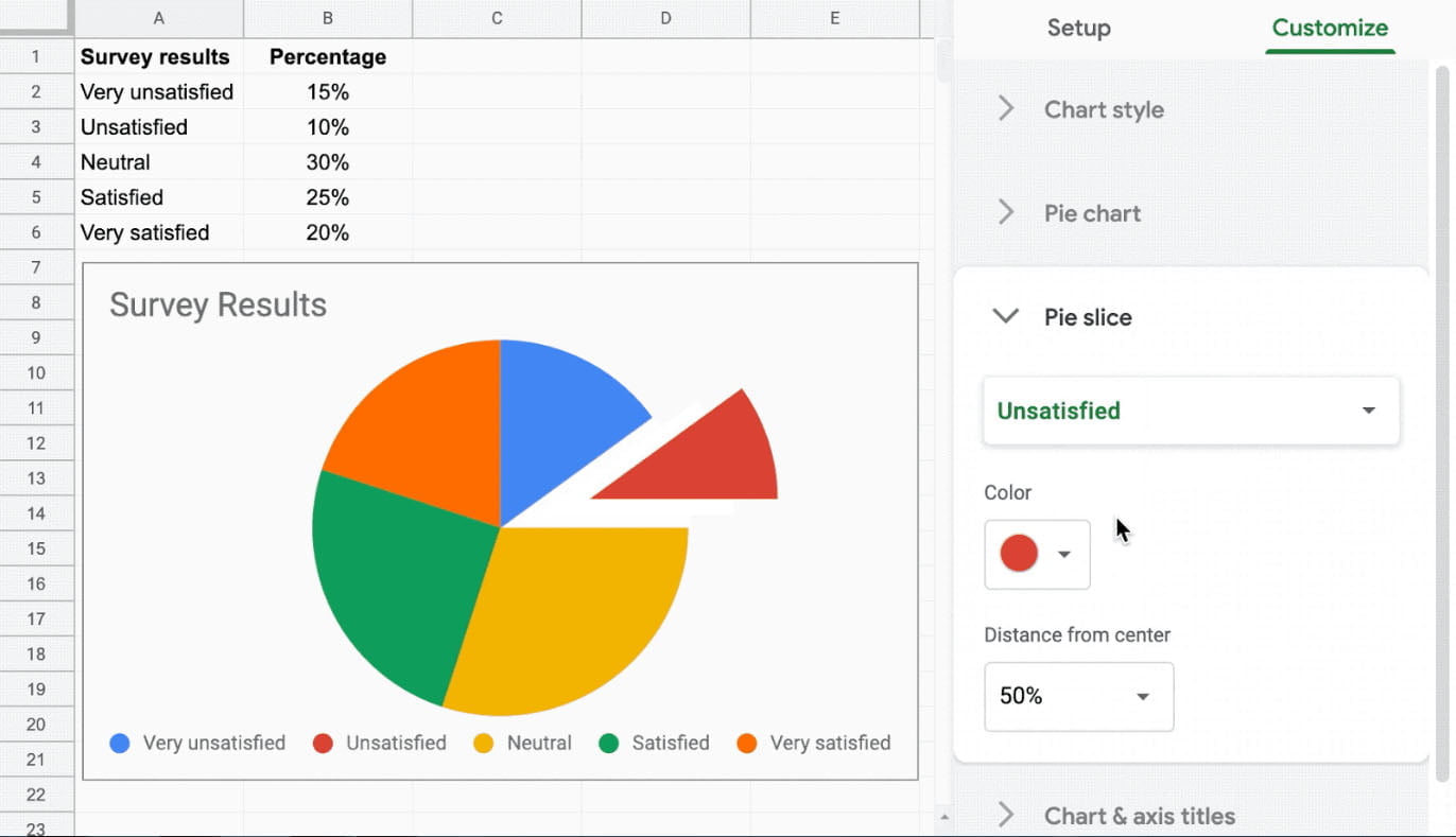
If you want to emphasize a single value in a form of exploded pie chart you can do that by accessing the Customize options tab while the chart is selected. In the customize tab, expand the Pie Slice options to change the settings for each individual slice.
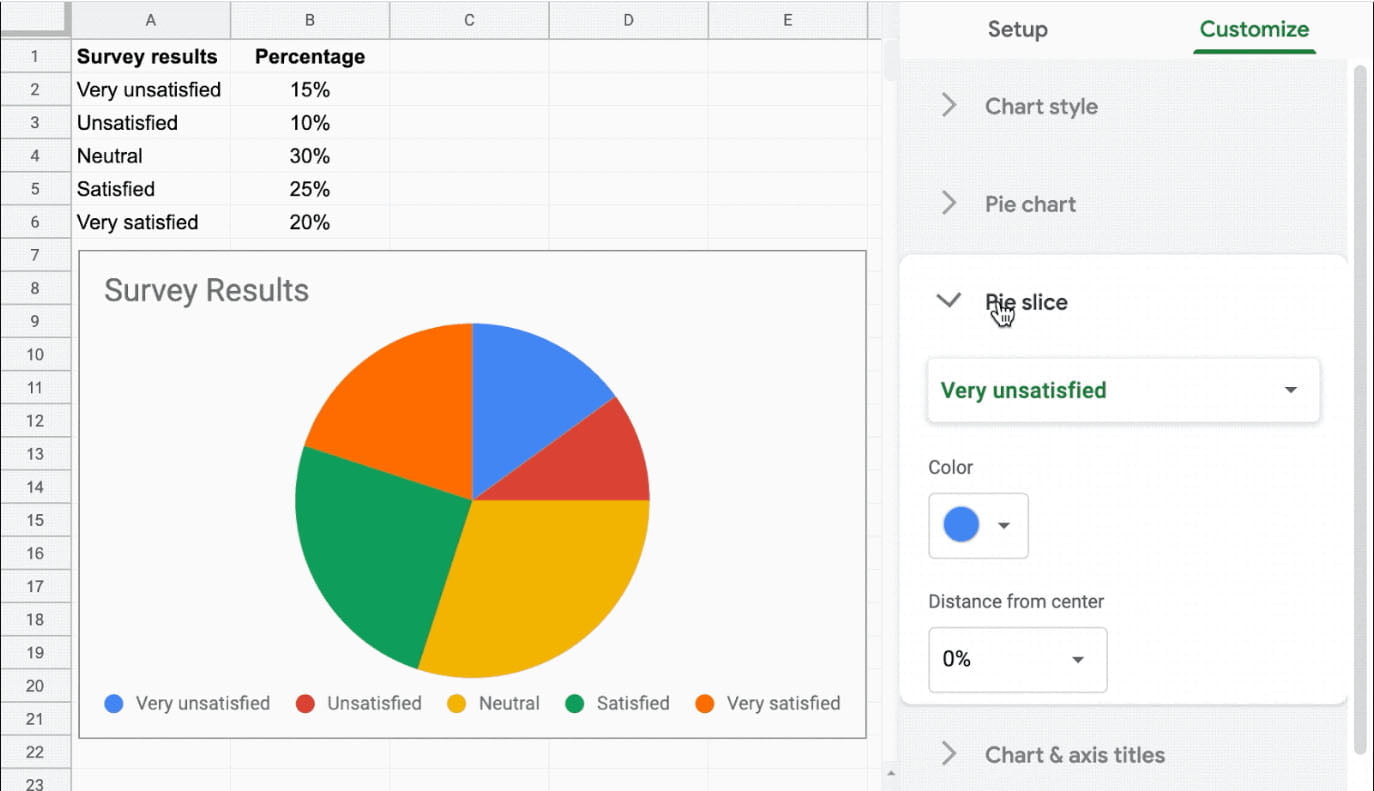
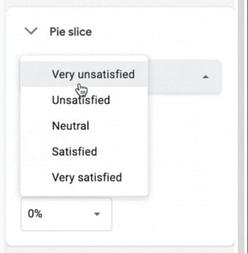
In the first drop-down list is the list of the values that are displayed in the Pie chart. Select the value that you want to expand like in the image.
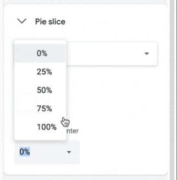
Next, to expand the selected slice, go to the second drop-down list “Distance from the center” and select the desired value.
After this your pie chart will look like this:
If you need, you can expand more then one slice, just select different slice from the drop-down list and chose a value for the “Distance from the center”.
Source: https://gsuiteupdates.googleblog.com/2020/01/break-out-single-value-within-pie-chart.html
